CTA Copy That Gets Clicks: 5-Part Framework & Tests

Call-to-Action Copy That Gets Clicks: A Practical Framework for Marketers and Creators
A call-to-action is the moment a reader decides to act—or move on. Strong CTA copy doesn’t “push” people; it removes uncertainty, makes the next step feel obvious, and builds momentum without adding pressure. Below is a practical framework to write CTAs that fit the page, fit the reader, and get tested quickly.
What a Call-to-Action Really Does (and Why “Just Add a Button” Fails)
A CTA is a micro-commitment: the next step that reduces ambiguity and increases forward motion. It can be a button, a link, a line in a caption, or a prompt in a video—anything that guides someone from interest to action.
The three jobs every CTA must do
- Clarify the action: The reader should instantly know what happens when they click.
- Reinforce the value: The CTA should echo the payoff—especially the immediate benefit.
- Reduce perceived risk: Add reassurance so the click feels safe (time, money, privacy, hassle).
Why CTAs commonly underperform
- Vague verbs: “Submit” and “Click here” force people to guess.
- Mismatched promise vs. page content: If the CTA suggests one outcome but the next page delivers another, trust drops.
- Too many choices: Competing links near the primary CTA create hesitation.
- Asking for too much too soon: Cold visitors rarely want “Book a call” before they understand the value.
CTAs also live beyond buttons: email links, social captions, landing page subheads, in-video prompts, and checkout nudges. The same principles apply everywhere.
A 5-Part CTA Formula That Works Across Pages, Emails, and Social
When a CTA isn’t converting, it’s usually missing one of these five pieces. You don’t need all five every time, but this checklist makes CTA writing repeatable.
- Action verb + specific outcome: Name what they get or achieve (“Get the checklist,” “Preview the examples”).
- Value hook: Lead with the immediate benefit—clarity, time saved, fewer mistakes—not the feature.
- Audience fit: Mirror the reader’s goal or identity (“For first-time buyers…,” “For busy founders…”).
- Friction reducer: Remove a common worry (“No credit card,” “Instant download,” “Takes 2 minutes”).
- Urgency/priority (optional): Use real constraints or relevance cues—never manufactured pressure.
| Channel | Weak CTA | Stronger CTA (same offer) |
|---|---|---|
| Landing page | Get started | Start the 7-minute setup |
| Click here | Download the template pack | |
| Social post | Link in bio | Grab the free caption prompts (link in bio) |
| Checkout | Continue | Continue to secure checkout |
| Webinar | Register | Save your seat (limited live Q&A) |
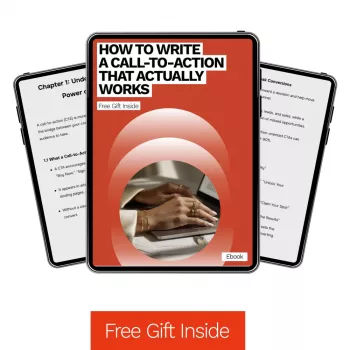
For deeper swipe-worthy examples and fill-in prompts, How to Write a Call-to-Action That Actually Works (ebook) is built to help marketers and creators rewrite CTAs faster—without starting from scratch each time.
Match the CTA to the Reader’s Stage (Cold, Warm, Hot)
Cold audience (low awareness, low trust)
Warm audience (they know the problem and want a solution)
Hot audience (ready to decide)
A classic mismatch: a cold visitor asked to “Book a call” usually needs a bridge first—like a short checklist or a preview that proves relevance. If you’re posting consistently and need a simple weekly system that naturally feeds warmer CTAs, TikTok Sprint Blueprint: 7-Step Weekly Content Checklist pairs well with stage-based CTAs because it turns “what do I post?” into a repeatable cadence.
Where to Place CTAs for Maximum Momentum
For usability guidance on clarity and links, resources like Nielsen Norman Group and Google’s mobile design principles reinforce the same idea: reduce cognitive load, make actions obvious, and keep mobile tap targets and wording clear.
High-Impact CTA Words and Patterns (Without Sounding Pushy)
Verbs that imply progress
Outcome language beats button language
Risk reducers that fit digital offers
Add trust cues near the CTA
A short testimonial line, a quick “what you’ll get” bullet list, or a credibility cue can do more than adding urgency. Be cautious with hype traps (“best ever,” “guaranteed results”) or fake scarcity—those often reduce trust and hurt conversions over time. For additional examples and best-practice patterns, HubSpot’s CTA resources can be useful for brainstorming variations to test.
A Simple Testing Plan: Improve CTAs in 20 Minutes
| Test type | What to change | Example |
|---|---|---|
| Outcome clarity | Add the result to the verb | “Start now” → “Start your first draft” |
| Friction reduction | Add a reassurance phrase | “Download” → “Download (instant access)” |
| Audience match | Call out the user type | “Get the guide” → “Get the guide for creators” |
| Proof near CTA | Add one proof line near button | “Join” + “Trusted by 1,200+ readers” |
| Design hierarchy | Reduce competing links | Move navigation links below the first CTA |
A Ready-to-Use Resource for CTA Copy: Ebook Guide
When the offer is solid but conversions lag, the problem is often the “next step” feeling unclear or risky. A structured reference makes CTA writing faster because you’re iterating from proven patterns instead of guessing. If you want a practical, reusable system to refresh landing page buttons, email links, social captions, and opt-ins, start with How to Write a Call-to-Action That Actually Works (ebook).
FAQ
What makes a call-to-action effective?
An effective CTA is clear about the action, specific about the outcome, relevant to the reader’s goal, and low-friction through risk reducers and nearby proof. It also matches the page’s promise and the audience’s stage of awareness.
How long should a CTA be?
For buttons, 2–6 words is a practical range; for links or captions, 6–14 words often works well. Add words when they increase clarity (the outcome, who it’s for, or a friction reducer), and test shorter vs. more specific variants.
Should CTAs use urgency?
Use urgency only when it’s true, such as a real deadline, limited spots, or seasonal relevance. False urgency can reduce trust; when in doubt, lean on priority cues (what matters now) and friction reducers instead.














Leave a comment